Monthly Archives: October 2014

Gordon Matta Clark Anarchitectural Resurrection

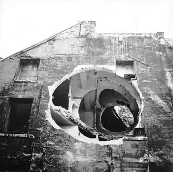
Gordon Matta Clark was an American artist who studied Architecture but didn’t practice it. He referred to his work as “Anarchitecture”. Gordon Clark got famous for his “building cuts”. He made controlled demolitions in abandoned buildings which gave an other dimension to their architecture. He didn’t create by constructing,by putting brick on bricks… but by demolitions,revealing and subtracting… That is why he called his work “Anarchitecture”.

Splitting, 1974

Undoing a Building

MC5

Paris Biennale 1975

4133_MG_8953.tif

Paris Biennale 1975

Circus or The Caribbean Orange" 1978

Circus or The Caribbean Orange” 1978

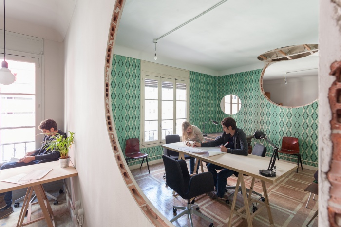
The HUBflat, a work of CH+QS arquitectos situated in Madrid,Spain can be seen as a modern resurrection of his work.

The  HUBflat which is originally a co working space began to have a large success as an event space. The question was then, how to combine these two functions without losing the look and feel of the space? By adding stuff? Touching without touching? What does it mean? Subtracting? Removing? Yes ! The creation of a new environment by removing.

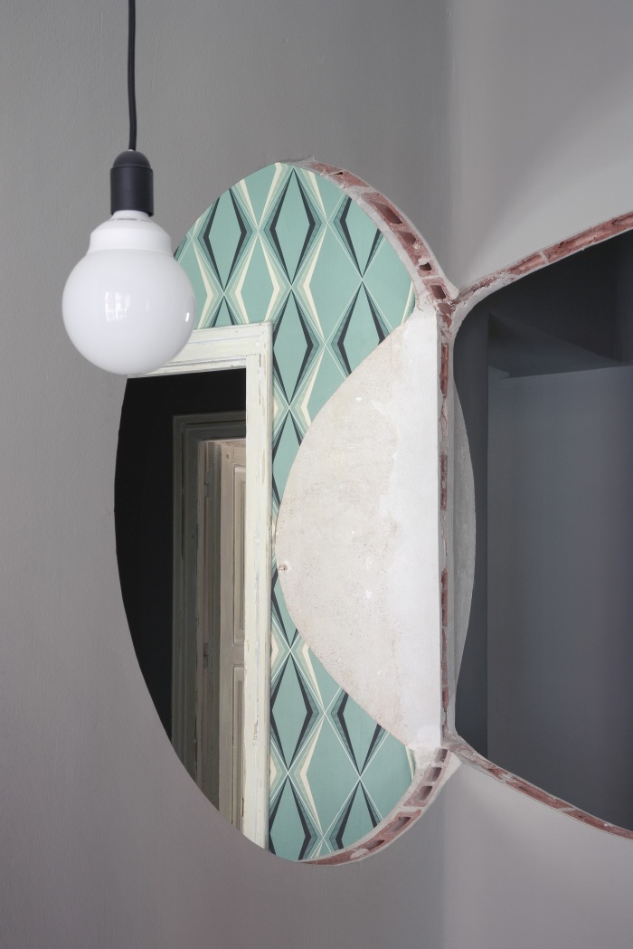
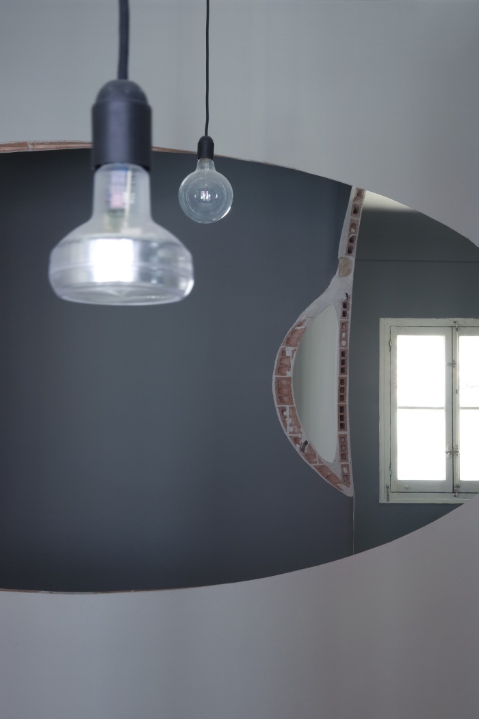
They came up with a controlled demolition and for that they used a huge cone and two spheres and subtract those volumes from the existing walls , ceiling and the floor.

what I really like about this project is the unexpected. The element of surprise.

Interior Architecture is not only adding walls and volumes… sometimes we have to think outside the box and see what can be done without constructing? Using the existing elements and the beauty of them.

Neg.

© Elena Almagro

© Elena Almagro

© Elena Almagro

© Elena Almagro

Courtesy of CH+QS arquitectos

Courtesy of CH+QS arquitectos

Courtesy of CH+QS arquitectos

Courtesy of CH+QS arquitectos

© Elena Almagro

© Elena Almagro

© Elena Almagro

© Elena Almagro

© Elena Almagro

© Elena Almagro

© Elena Almagro

© Elena Almagro

© Elena Almagro

© Elena Almagro

Detail

Detail

True meaning of Minimal

Art Déco, Art Nouveau, Rococo, Modernism, Classic,Industrial… We have seen it all. Today’s big Interior design trends seem to be Minimalism and Nordic/Scandinavian design.

My opinion is that we assign a style to a work a little too soon. We should first understand where this styles come from to be able to identify our selves with them.

What does Scandinavian design mean? Light, fresh and a pure interior with a lot of light and use of natural materials. Scandinavian design started in the 50’s. That makes this movement a post WII style. The main thought behind Scandinavian design is to create an environment which is functional, simple and minimal. The use of natural materials such as wood originate from the ideology of low-cost/affordable design.The idea was to create a home where everybody can get used too and can pay for,realizing this ideology by using low-cost and mass produced materials.

Minimal? What does that mean? A white box with a chair inside it? Could be… But every interior has a meaning. Why is that chair placed there? Should everything be white to be minimal? I disagree. Minimalism is a very spiritual movement in my opinion.It started in the 60’s by visual arts and music. It was introduced into architecture later on. The main Characteristic of minimalist movement is the pureness of it. You only see what you need to see to understand and be able to live. Other styles have visual characteristics such as specific use of materials and colors. But Minimalism does not and in my opinion, that is exactly why it cannot be defined with a red line.

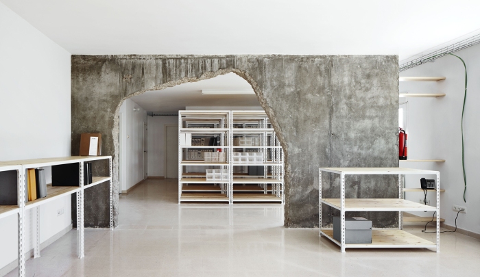
This project is situated in Spain and realized by Cifuentes Olivier Arquitectes. I saw the chance in this project to talk about this subjects and stay in the concrete mood at the same time (last post). As you can see, this isn’t the image that you would imagine by hearing the word Minimal. But it is.

The goal of this project is to join 2 separated locals and use the space as an archive.

This is what Minimal means to me.

© José Hevia
© José Hevia

5449a5bde58eceb56700025d_reform-of-two-places-cifuentes-olivier-arquitectes_portada

© José Hevia

5449a5afe58ece999700026b_reform-of-two-places-cifuentes-olivier-arquitectes_03_arxiu_ibavi_1440

© José Hevia

The architects of this project tried to reduce the budget by eliminating the unnecessary elements. They used the actual characteristics of the building to provide an atmosphere. By cracking the concrete wall open, we can feel the roughness of the building but at the same time, by revealing the traces of the ancient wall covering, the glue, the tubes and the “imperfections” of the architecture, we feel the fragility of the building. These are the elements that most of the architects try to hide behind a smooth wall…

Floor Plan

Floor Plan

They also eliminated the use of artificial air conditioning, simply because of the fact, that the building is located nearby the sea and they can enjoy from the sea breeze which provides a pleasant temperature.

5449a5b9e58ece999700026c_reform-of-two-places-cifuentes-olivier-arquitectes_04_arxiu_ibavi_1440

© José Hevia

The shelving is done by simple old fashion metallic shelves. By adding a touch of wood , they brought in a warmth that metal doesn’t have.

Neg.

Nud Collection- Base – Review

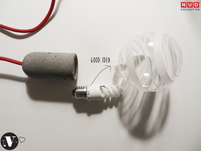
In my post LightMania I briefly talked about the Nud Collection pendants. Now I can talk about them more profound because… I got one!! And I must say that all my expectations are fulfilled. The color of the cord, the branding details, the smooth concrete finishing… I am totally in love. This product was originally a pendant, but I like it much better as a gadget. That is why I asked the handy Mr P. to convert it to a standalone lighting element.

Another great point about the Nud Collection is the user-friendly website they have. It gives the viewer a wide overview of all products in a single glimpse. Their webshop is even better… you only need to make the combination you like and you immediately see the corresponding price.

This is a great no-nonsense Nordic design and we love it here. Let me know what you think in the comments.

Neg.

Nud collection : http://nudcollection.com/

WebShop : http://nudstore.com/ 

Thx to Nud Collection for making this post possible.

3

1

2

Beside the fact that you have many options in bulbs and wires, you can also choose a flexible bulb. By that I mean that the lighting element and the bulb are separate (see in the pictures above). This makes life so much easier… Often, when you buy a bulb, the lighting element and the bulb are connected. That way if the lamp is broke, you have to order a complete new one… (can be pricey sometimes) But with this bulb, you can change the lamp whenever you want to… When it is broke or when you simply want to change… Which is genius!

45

6


Like and Share TwistedVi13. on WordPress and Facebook, and make a chance to win one of the handmade concrete houses in the picture.

Halloween Made of Paper

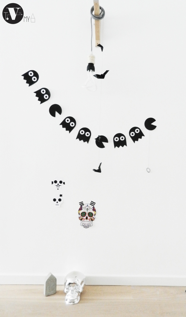
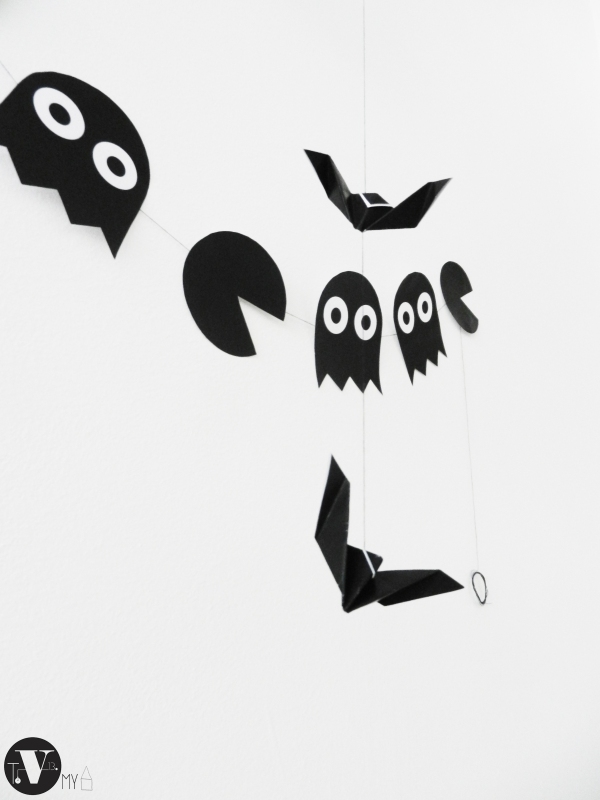
Halloween is coming … Different holidays are fun, no doubt about that. We try to be more creative  every year then the year before. But buying all that decoration can cost a lot of money. I never use a holiday decoration 2x in a row, that is why I don’t want to spend a lot of money in buying them. As I told you before, I like to change what is around me (except for Mr P. of course !) … For the first Halloween in our new apartment, I decided to make something my self. A few days ago, I bought a silver skull  (just because I like skulls) and I tried to match that with other origami decoration and create a complete wall for this Halloween. I used of black tape to give my paper sugar skulls some personality. I like the results to be honest, it definitely is Halloween-ish, with a small touch of irony.

Let me know what you think in the comments bellow.

You can find the printable for the Packman ghost garland by clicking here.

4 321

Neg.

Stay tuned for tonight’s  big post and… a give away!

This Chair

Today’s lifestyle is one in which we spend a lot of our time seated (me included). Studies have shown that sitting for a long amount of time can cause heart diseases, a higher blood pressure, obesity and higher cholesterol, back and neck problems… and these are just a few of them. You would think that a lot of sport and exercise can help that but it is not always true. The fact is that  sitting still is not the only problem, we are sitting wrong… Crossed legs can cause a slower blood circulation and knee problems, a wrong back posture is a huge cause of pack pain, etc.

Benoit Malta, a French Industrial Designer may be having the solution to that problem…

He has designed a 2 legged chair called ‘inactivité’ (thx for the ironic name). Maybe a bit odd at the first sight, but when you think about it, this can be THE step towards the solution.

This ‘simple’ wooden chair makes you use your leg and hip muscles to balance the chair. This is obviously not a lounge chair but all I can think about is why not?

I don’t think that this chair will be used in its actual form for the offices but this can be a step in the right direction. See for your self.

Click for Benoit Malta 

Neg.91_6_1200 81_5_1200dsaadp2014_malt.2bf22154609.original-e1408598276982benoit-malta-6-tt-width-620-height-413-crop-1-bgcolor-000000-except_gif-1   n2_1200

Nicolas Vahé – FoodConcept and packaging

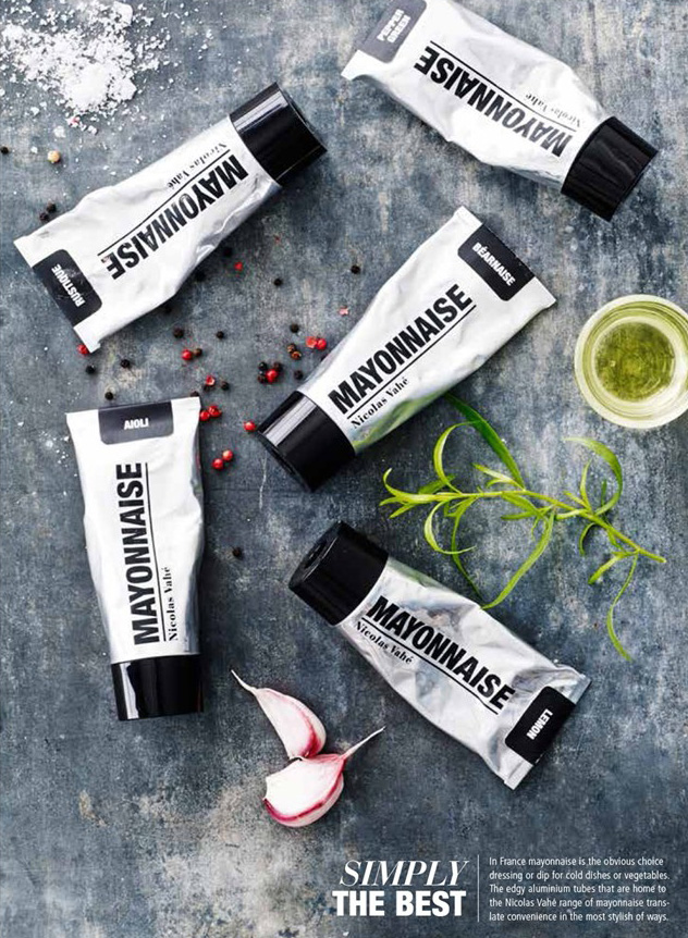
Nicolas Vahé is a French Chef cook born in Amiens in the northern part of France. Before becoming the best Frans chocolatier, he has been working at the “Pic Valence” , a French 3-star Michelin restaurant. In 2000 he moved to Denemarken and became a pastry chef. Beside his talent in combination of tastes, he started his own food concept brand in 2007 (Thank you for that). This blog is not a food blog of course BUT his packaging is just so genius that everybody should know about it. And now that we are in the spirit of typography, this fit perfectly in the content.

Nicolas Vahé has a great way to combine traditional food as we know it, with a modern and durable packaging. His products are delicious to eat and beautiful to have in the kitchen. I am a fan :).

Here are a few of the pictures from his new catalog that is online, you can find him by clicking Here.

Neg.
nv 2 nv3
NV_03n v 1 180313-flessentasje-nicolas-vahe
nv5nv 4
Paper bag - the Contents - Nicolas Vahé -  Accessorize your Home

A cabin retreat for a multigenerational family | Reiulf Ramstad Architects

Love 🙂 !

Small House Bliss

This retreat for a multigenerational family is divided into three parts, a central cabin for socializing and two private sleeping cabins. In all there are 2 bedrooms and 2 sleeping lofts in 753 sq ft. | www.facebook.com/SmallHouseBliss

A two-hour drive along the coast south from Oslo, Norway brings you to this family vacation compound. A couple and their two adult offspring with families of their own wanted a cabin retreat that they could all share and enjoy. Reiulf Ramstad Architects designed a grouping of small cabins for them.

View original post 185 more words

Typographic design

I love to decorate the walls, I think that a good interior design begins on the floor and goes up to the ceiling. That of course does not mean that you have to hang something on every centimeter of the walls, but we definitely shouldn’t forget them either.

I love the black and white art. But what I love too, is change. I get tired of things very soon , I need movement in my environment. I cannot change my furniture every month or two but what I can do, is changing the accessories that I have around once in a while. This is also the reason why I like DIY’s so muc. I know that I can create something I like, I made it, and it is not too expensive so it can be changed when I get tired of it.

One of the least expensive and FUN DIY’s that you can do, is Typographic design. You just write a text or print a text that inspires you … That easy. It costs one paper and a little bit of ink. The rest is pure imagination! You tape those on the wall and you change them when you get tired of them.

These are some of the topographies that I have in my home.

photo 5a
2

This one hangs beside my bed. As you know, I have a big fascination for the stars and this text inspires me.

8

These three, hang above my Make Up table. the number 13 is my lucky number.Like most of the women in the world… I love CHANEL, seeing the the history of the N°5 CHANEL bottle in the morning, makes me feel luxurious over and over again :).

9

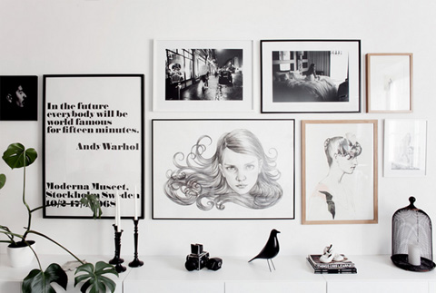
The all time favorite, Andy Warhol Quote, Moderna Museet – Stockholm Sweden. No words needed to explain that one.

These  are a few topographies that I really LOVE, I think that a few of them will replace a few of the prints here above … very soon.

il_570xN.495251696_a31h

A minimalist Calendar, Pure and simple! Very handy too ! You can write your notes on it and keep it. I keep my calendar and agenda’s and once in a while I read one of the old once… It is like a diary but you have keywords instead of texts.

work minimalistic typography eye test 2560x1440 wallpaper_www.wall321.com_42 28938__photographer-home-design-3 donnawearmouth1

I think that this one will be hanging in the office soon enough ! CORBUSIER, LE  ^

90db092960f1185066838996cbeb4ff6

Neg.

Ikea Basic Crush #3

You have already noticed that I am a BIG fan of lighting, but it can become really expensive very soon, specially when you have a job like me and you see all the big brands in different projects everyday. But I often have to compromise… I have a few favorites that I will buy in the future (no doubt about that) but in the meanwhile I try to be creative without spending too much money.

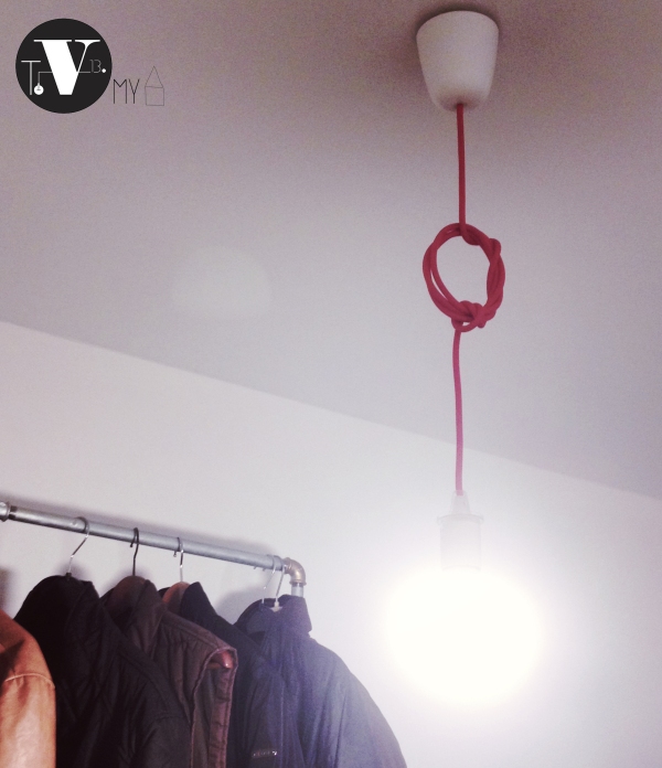
So for today’s post , I prepared a Ikea  Hack pendant  lighting. This one is hanging in our office for the moment but as I told you before, the office is not finished yet, therefore the total picture of the office will be up later ( hopefully soon).

The total cost of this project is 16,98 €.

It is a combination of Ikea SEKOND in red and the LEDARE bulb.

The LEDARE bulb has a few texts and Ikea branding on it which I didn’t really like so I decides to cover them with a Black Matt tape.

I made a knot to make the whole thing more interesting. You can find the different kind of knots and how to do them by clicking here.

See …you don’t have to pay a lot to have an up to date interior 🙂 .

Neg.

PROD IKEAlamp

222

knot

This was International – biennale Interieur 2014 Kortrijk Belgium

Hello 🙂

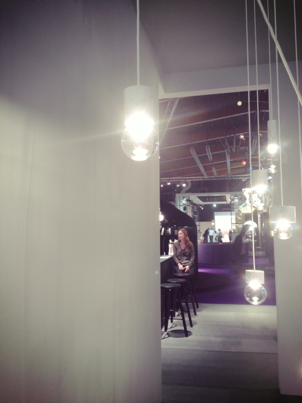
As I told you in my last post, the next few weeks will be a little busy because I am visiting a few exhibitions in Belgium, Germany and Venice. I visited the first one last friday and I was positively surprised. I found a lot of stands and products that I really liked.

After my visit , I concluded that there are 3 trend lines going on for the moment.
One is all about more expensive materials like marble and brons. On the other hand we have the cradle to cradle design that still exist and is entering 2015 as well but the new thing about that was the flexibility of the objects. The user gets the freedom to choose different pieces and put things together as he needs them like meccano pieces. A lot of products are modular and can be used in different forms which gives a huge flexibility to the user! Two in one … What is greater than that?

I made a selection of my favourite stands. Enjoy.

Neg

IMG_0610.JPG

IMG_0604-0.JPG

Flos Design ^IMG_0602-0.JPG

IMG_0613.JPG

Dark Belgium ^IMG_0605-0.JPG

b

&Tradition ^IMG_0603-0.JPG

IMG_0608.JPG

IMG_0606.JPG

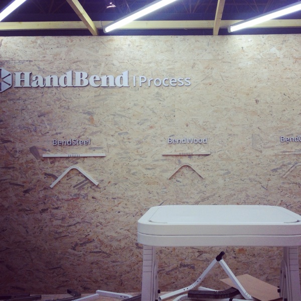
Hand Bend – One of my favorites !! Such an interesting concept ! Visit their site for more info . http://www.handbend.com ^IMG_0609.JPG

Vij5.nl ^

IMG_0607.JPG

d

Wever & Ducré amazing stand! ^

z Quize & Milaan

IMG_0616.JPG

IMG_0617.JPG

Thx for visiting

Copper and Peachy Pink – Colors of 2015

In my previous post, I talked about the Pantone color forecast for the upcoming year. 2 of my favorites (in my selection) were Strawberry ice and Marsala.

you can read the full post here.

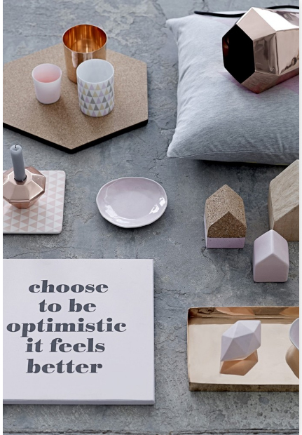
Pantone gave a full forecast based on the fashion shows and catwalk colors but it is enough to surf through the websites about interior design and design brands, and soon enough you will get a idea of the direction they are going to … and my 6th sense says Copper Orange and peachy pink are the upcoming color trends.

The months of October and November are the two most important months of the year for the interior designers. Why? The fashion shows are just finished and a lot of home accessory and furniture brands bring out their new collections during this period. There are also a lot of interior and design fairs going on. This Friday is Interieur Kortrijk 2015 in Belgium that I will be going to, Next week is Orgatec in Cologne, I will be attending that too and… begin November will be my favorite fair because it is going to be a special trip to somewhere magical, but I will tell you about that later on 🙂 .

Back to business . Here is my moodboard of the orange copper and peachy pink products.

moodboard copper

Last year we saw a lot of relaxing pastel colors and a lot of gray and white in our interiors. 2015 seems to bring a little bit of warmth into our homes. If you think that coloring the walls is a bit too harsh for your taste, using colored accessories is a great way to introduce colors into your interior.

1. Bloomingville Candle holder

candle blv

2. Bloomingville Copper Basket

3. Muuto Mika Tolvanen Storage basket

431Muuto14_iso4. Bloomingville marble copper table

Blv table

5. Bent Hansen Chocolate Cushion

6. Norman Coppenhagen plaids

7. Hay Slit table

8. Tom Dixon Copper shade

img_1368_h

I will start my shopping soon, which one is on your list?

Neg.

LightMania

One of my specialties in Interior design seems to be(from what I hear at work) to find the perfect lighting that goes with an interior and the concept of it.

As I wrote in my previous post, I work in an interior design company which does projects for offices and a lot of the time we have conceptual works for which we propose different lighting. In that way I am familiar with a various typologies in lighting.

In this post I will give u a variety of the current pendant trends. To make everybody happy, I chose products that are high in trends but stay affordable.

Here bellow you will also find a list of the different products and their prices.

111

1. NUD Collection (Click) – link to Webshop (Click NudShop)

Item = Base collection

Wire = TT – 101

Bulb = Glob 80mm

attachment = Round white

TOT Price= 94 €

2. NUD Collection (Click) – link to Webshop (Click NudShop)

Item = Base collection

Wire = TT – 99

Bulb = White 125 mm

TOT Price = 93 €

What I admire about the NUD Collection , is the flexibility of it. you are free to choose from a number of fun colors for the wiring and bulb designs, and thanks to the GREAT website, you can see directly the price of your composition! I LOVE this product because of the fact that you can go as affordable as you want and stay DESIGN and CLASSY at the same time.

3. TOM DIXON (Click)

Product = Etch Shade Brass

Price = 375 €

4.Plumen bulb (Click)

Product = Plumen 001

Price = 29,95 €

5.Dark Lighting (Click)

Product = La Cage

Price = 147€

This is a Belgian product and I am proud to present.

6.7. MUUTO (Click)

Product = E27

Price = 59€

8. MUUTO (Click)

Product = Unfold

Price = 139€

9. Lee Broom (Click)

Product = Crystal Bulb

Price = 240 €

Let me know which one is your favorite, you already know mine 🙂 !

Neg x

Home Office – Inspirations

Since we moved in our new apartment, all the rooms are practically done. But the office is still hanging in there. A lot of people (me included) forget about their work space at home. Of course we do have a table, a chair and a computer in there ( the necessities to be able to do your job) but the office can be one of the places where you spend a big amount of your time in and it must not be left behind. Specially in our home, keeping in mind that I work in a company who is specialized in the conceptual design, total renovations of offices and the NWOW(New Way Of Working)…

I am still searching for a good composition for our work space but in the meanwhile here are some (Pinterest) inspirations for you guys.

Neg x

0bdf5987a68bc9917d5d198c858f4ddc

scandinavian-shared-workspace

736c2c478bb5eb2b1c1920a94f14b201

59a1a63f9185ca5c2f7bd41aab28fb26

white-nordic-desk

d988eed1221677f0faf8edb7f270ffd2

Found on Homedit

Ikea Basic crush #2 Nordic Wall Lighting

Hello Everyone,

Sorry for my delay, I have promised to post an Ikea Basic crush each Saturday but unfortunately I don’t feel very well this weekend so I had a good long rest under the covers yesterday. Mr. P is taking a very good care of me… Green tea and honey, Soup … It feels good to have a caring person around.

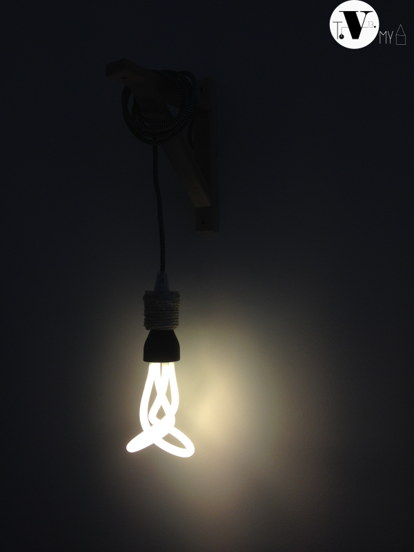
Anyways… Back to the subject, when we moved in this apartment, we had two big holes in our wall which were supposed to be the connections for wall lamps. I hate wall lamps… So I decided to make something in between a pendant and a wall lamp (you know … compromise)! With a little help from the web I came up with this creation. It is something unique and everybody seems to like it even though it has a very particular Nordic style (which I love).

So today’s Ikea Basic Crush is a composition of 2 Ikea products. EKBY VALTER Console and SEKOND pendant cable.To hide the plastic lampholder, I used a beige cord.

The Lamp is a PLUMEN collection.

Total cost = 4,99 € + 2€ + 28,99€ = 35,98 €

The Plumen Lamp is a bit pricey compared to the total composition but you can choose any lamp you want for this project. Next Saturday I will show you an other DIY pendant creation in our office with a pimped up Ikea Lamp and a total cost of 18,98€ so stay tuned.

Do you have an Ikea crush?

Neg x

Untitled-

lamp-ikea-b-33

Lamp-ikea---b---4

Lamp-ikea---b---5

Lamp-ikea---b---2